

by Andrew Kliman and Ralph Keller
Introduction
This article expands on Ralph Keller’s recent response to a 2023 article by Seth Ackerman in Jacobin. Ackerman claimed that the rate of profit cannot fall because of labor-saving technical change, contrary to what Karl Marx’s theory says. Keller showed that Ackerman’s arguments do not hold water because he roots them in the so-called Okishio Theorem, which has been disproven. Decades ago, proponents of the temporal single-system interpretation (TSSI) of Marx’s theory refuted the “theorem” and produced an interpretation of Marx’s theory that makes it logically consistent. But Ackerman ignores all this, acting as if the TSSI does not exist. Keller called out this behavior, labelling it an act of intellectual immorality. And he explained why the rate of profit can indeed fall because of labor-saving technical change, contrary to what the “theorem” claims.
Ackerman also dismissed well-known evidence that the rate of profit in the US fell after the 1960s and never recovered. He claimed that this fall is a “statistical mirage,” resulting from inaccurate measurement of depreciation, and that “obviously … superior” estimates of depreciation based on Canadian data lead to the conclusion that the rate of profit in fact soared from the mid-1980s onward. In his response, Keller noted that “even if the Canadian depreciation rates are, in fact, more reliable”—which the researchers who produced the new estimates of depreciation did not claim—“Ackerman’s rising-to-the-skies upturn in profitability after 1985 is bogus, because he egregiously misuses the data.”
The present article explains and justifies these conclusions in greater detail. We demonstrate that Ackerman’s sharply rising rate of profit is the result of his “cowboy scientist” behavior—egregious mishandling of data and an equally egregious distortion of a recent experimental study on depreciation. We first point out that he sloppily includes the capital stock of nonprofit institutions and households in his estimate of the capital stock of private enterprises. We then turn to Ackerman’s misrepresentation and misuse of the experimental study on depreciation, showing that he ignores its repeated warnings that Canadian depreciation rates may not be applicable to the US and that its modeling of a sharp rise in depreciation starting in 1985 is unrealistic. We then demonstrate that this sudden and unrealistic rise in depreciation produces extremely implausible movements in net investment, the capital stock, productivity, and the relation between capital accumulation and economic growth. Finally, we show that proper use of depreciation estimates contained in the same experimental study removes the skyrocketing trend in the rate of profit that Ackerman reported. Recovery of the rate of profit to its 1960’s peak level is the real statistical mirage here.
The appendix to the article details our sources of data and computational procedures.
Comparing Apples and Oranges
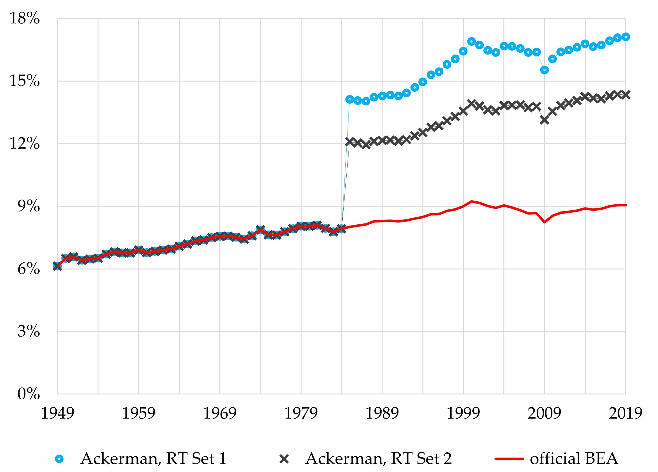
Ackerman’s article includes a graph of three estimates of “the US profit rate” (see Figure 1). He claims that the three estimates are “[t]he profit rate of the US business sector calculated from official statistical series … and from two alternative measures of the capital stock” that use Canadian depreciation rates.[1] That statement is not correct. The text below the graph indicates that the rate “calculated from official statistical series” is indeed an estimate of the rate of profit of the (private) business sector. But Ackerman’s two alternative rates are not.
Figure 1. Ackerman’s Rates of Profit

His alternative capital-stock measures come from a recent study that we discuss below. They pertain to the entire private sector—not just private businesses, but households, nonprofit institutions, and tax-exempt cooperatives (collectively owned nonprofit businesses) as well. Thus, the rate of profit based on official data expresses profit as a percentage of businesses’ capital stock, but Ackerman’s alternative rates express it as a percentage of the entire private sector’s capital stock. These rates are measuring different things. Ackerman is comparing apples to oranges.
Furthermore, the meaning of his alternative “rates of profit” is obscure at best. They are weighted averages of the rates of profit of private businesses, households, and so on. But what does “households’ rate of profit” even mean? What is the meaning of “nonprofit institutions’ rate of profit,” and of “collectively owned nonprofit businesses’ rate of profit”?
Comparison of apples and oranges, and computation of nonprofits’ and households’ “rates of profit,” are significant problems. But we do not want to make too much of them. They pale in comparison with the other errors that Ackerman makes in his rush to conclude that falling profitability since the 1960s is “entirely attributable” to the mismeasurement of depreciation (emphasis in original).
Ackerman’s “Obviously … Superior” Canadian Depreciation Rates
When US governmental agencies compute the annual depreciation of fixed capital assets, they currently use rather old estimates of depreciation rates in the US. Ackerman claims that it is “obviously … superior” to use more recent Canadian depreciation rates instead. He writes that “new research … has confirmed long-standing suspicions about even the approximate accuracy of official capital stock estimates” (emphasis added). He also argues that, because “Canadian capital stock measures are regarded as being particularly reliable,” use of recent Canadian data to estimate depreciation—not just depreciation in Canada, but depreciation in the US as well—is “obviously a superior method to the use of a handful of forty-year-old studies.”
Ackerman tries to support these conclusions by citing a recent study that considered the application of Canadian depreciation rates to US data. It was written by Michael D. Giandrea, Robert J. Kornfeld, Peter B. Meyer, and Susan G. Powers. Kornfeld is employed by the Bureau of Economic Analysis (BEA) of the US Department of Commerce; the other three authors work for the Bureau of Labor Statistics (BLS) of the US Department of Labor. They wrote a working paper on the topic in 2021, and the Monthly Labor Review carried a shorter article by them, based on the working paper, in 2022. We will refer to these works as GKM&P 2021 and GKM&P 2022, respectively.[2]
The only reason their study seems to support Ackerman’s conclusions is that he egregiously distorts and misuses it. The authors did not say that they had confirmed that official depreciation estimates are inaccurate. And they did not claim that use of Canadian depreciation rates to estimate depreciation in the US is a superior method, much less obviously superior.
To the contrary, their working paper states that they “could not arrive at a clear consensus as to the most appropriate depreciation rates for the U.S.” (GKM&P 2021, p. 3). They indicated that additional research is called for: “we hope this work leads to more research on the topic” (ibid.).
The authors went on to explain why they refrained from recommending that Canadian depreciation rates be applied to US data. One reason is that “true depreciation rates may differ across countries for many reasons, so one should be cautious about applying rates from other countries to U.S. assets” (GKM&P 2021, p. 13). Several pages later, they reiterated this warning and then specified several reasons why depreciation rates vary across countries, even countries as similar as Canada and the US:
Differences in the mix and scale of industries, relative prices of capital and labor, capital utilization, economic and financial conditions affecting investment, tax policies, and climate across countries may impact capital asset depreciation rates. The variation in depreciation rates for structures in particular may reflect differences in building standards and land use regulations. [GKM&P 2021, pp. 19-20]
The authors also reported that they had consulted with other experts about this issue. Some of these experts “expressed concerns about using depreciation rates from other countries because true depreciation rates may differ across countries for many reasons,” and “[m]any also recommended proceeding cautiously in updating these rates”—the depreciation rates currently used by the BEA and the BLS—“given the numerous challenges in estimating depreciation” (GKM&P 2021, p. 22).
A third reason why the study yielded no consensus judgment is that the authors were unable to determine why prior studies had arrived at conflicting conclusions regarding the rates of depreciation most appropriate for the US. “We could not precisely quantify the reasons for the different findings” (ibid.).
Experiments/Simulations vs. Official Data
The study’s authors used Canadian depreciation rates to derive alternative estimates of depreciation, net investment, and the capital stock in the US private sector. But because of their own concerns, and the advice of external experts to proceed cautiously, they did not recommend that these alternative estimates be adopted as official measures. Instead, as we noted, they called for “more research on the topic” (GKM&P 2021, p. 3).
Why, then, did they decide to publish their alternative estimates of depreciation, net investment, and the capital stock? Their main purpose was to describe “the potential impact of using the depreciation rates from Statistics Canada on several key BEA and BLS capital measures” (GKM&P 2021, p. 24). In other words, they conducted a “what if” analysis: What if US statistical agencies were to use Canadian depreciation rates? How would that affect our estimates of depreciation, the capital stock, productivity, and so on?
Accordingly, their working paper stresses repeatedly that their alternative estimates are experimental. For instance, the titles of sections IV and V refer to “Experimental Use of Canadian Service Life Survey Data” and “BEA and BLS Experimental Capital Measures” (GKM&P 2021, p. 24, p. 28, emphases added). In contrast, the authors’ 2022 article rarely uses the term “experimental.” Yet it refers to “simulation,” “simulated,” etc., more than three dozen times, and it explains that they use “simulated” to mean the same thing as “experimental”: “We refer to the official estimates by BEA and BLS as the ‘published’ figures and compare them with our experimental estimates based on the services lives in the Statistics Canada data, which we call ‘simulated’ estimates” (GKM&P 2022, end of introductory section).
Ackerman’s article makes no mention of the fact that the alternative depreciation and capital-stock numbers he took from this study are merely experimental. On the contrary, as we have noted, he claims incorrectly that these numbers are “obviously … superior” to official estimates and that they confirm that the latter are not even approximately accurate.
The “Historical Trial” and “Recent Trial” Simulations
The authors of the study computed two sets of alternative depreciation rates for the US private sector. Set 1 directly applied Canadian depreciation rates to US asset data. Set 2 was a hybrid; it used both Canadian and US data to compute depreciation rates.[3] The authors then used the Set 1 and Set 2 depreciation rates to estimate depreciation, net investment, and the capital stock in the US private sector. They did so in two different ways.
In their “historical trial,” they “replaced existing [i.e., official] depreciation rates with the revised rates for the entire sample period.” In their “recent trial,” they “maintained the existing depreciation rates through 1984 and introduced the revised rates for all assets beginning in 1985” (GKM&P 2021, p. 28). We will call these trials HT and RT for short. Since the authors computed two sets of estimates for each of the two trials, they generated four distinct tables of experimental estimates of depreciation, net investment, and the capital stock (published in GKM&P 2021, pp. 113-116).
To compute his revised (Set 1 and Set 2) rates of profit, Ackerman used only the RT estimates. This was an extremely consequential move. As we will show below, the reason his rates of profit skyrocket is not that Canadian depreciation data were involved in their construction. Had he used the HT estimates—which are based just as much on recent Canadian data as the RT estimates are—he would not have obtained rates of profit that soar up, up, and away. In short, he obtained his soaring rates because he used the RT estimates rather than the HT ones.
Ackerman decided to use the RT estimates even though the study’s authors warned that they are unrealistic. In their 2022 article, they noted that, although they “maintained the existing depreciation rates through 1984 and introduced the revised rates for all assets beginning in 1985” when they computed the RT estimates, “[r]eal depreciation rates most likely change gradually,” rather than in this abrupt manner (GKM&P 2022, 1st para. of “Simulation of capital measures using the revised service lives” section).
They reiterated this warning in the next paragraph of their article: “The notable upward revision to depreciation in 1985 results from our abrupt introduction of new rates in that year. A gradual transition in which rates were slowly revised upward over several years before 1985 is more realistic” (ibid., 2nd para., emphases added). Similar warnings appear in the authors’ working paper (GKM&P 2021, p. 29).
Unrealistic Implications of Ackerman’s “Recent Trial” Data
Just how unrealistic are the RT estimates that Ackerman employed? To answer this question, we will begin by looking at their implications for economic variables other than the rate of profit.
Our discussion will focus especially on the implications of the RT’s Set 1 estimates, which are more extreme than its Set 2 estimates, because Ackerman specifically endorses the Set 1 figures when he argues for the use of “Canadian asset-life figures,” “high-quality Canadian data on asset service lives,” to estimate the depreciation of US assets. Only the Set 1 figures employ Canadian service-life data; the Set 2 figures do not (see note 3 above).
The most obvious unrealistic feature of the RT estimates is the abruptness of its simulated rise in the depreciation rate (see Figure 2). The private sector’s aggregate rate of depreciation increased by a total of 1.8 percentage points between 1949 and 1984, an average of 0.05 points per year. By assuming that fixed assets in the US economy suddenly switched over, in 1985, from that pattern of depreciation to one governed by Canadian rates, the RT implies that the Set 1 rate of depreciation increased by 6.2 percentage points that year. That is more than triple the entire increase throughout the 1949-1984 period and more than 120 times as great as the average annual increase during those 35 years. (The Set 2 rate of depreciation rises by 4.2 percentage points in 1985, which is more than double the total increase, and more than 80 times as great as the average annual increase, between 1949 and 1984.) Then, just as abruptly, the super-rapid increases in the RT rates of depreciation in 1985 are replaced by much slower ones from 1986 onward, averaging less than 0.1 percentage point per year.
Figure 2. Rates of Depreciation, US Private Sector
consumption of nonresidential fixed assets as % of their current cost at start of year
Changes in rates of depreciation lead to changes in the rate at which capital accumulates. This is true by definition. The accumulation of capital, also known as net investment, is the amount by which the value of the capital stock increases—total new investment in capital assets minus the depreciation of existing capital assets. All else being equal, capital accumulation declines when depreciation increases. Thus, by simulating a massive and abrupt rise in the rate of depreciation, the RT produces a massive and abrupt collapse in capital accumulation (see Figure 3). This is just as unrealistic as the abrupt rise in the rate of depreciation itself.
Figure 3. Net Investment in Private Fixed Nonresidential Assets, US
investment minus consumption of fixed capital; billions of dollars
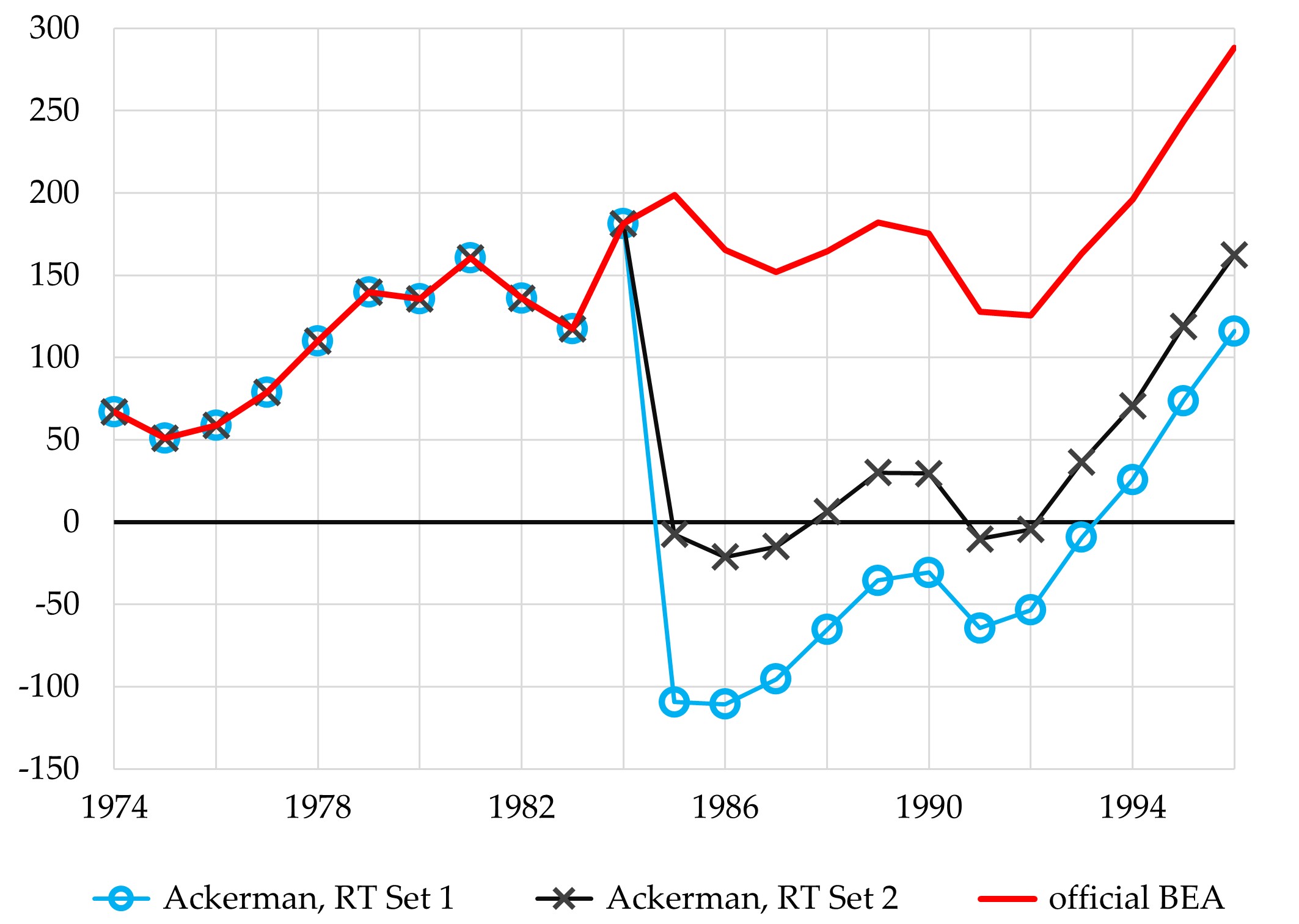
The RT’s Set 2 depreciation figures imply that there was almost no capital accumulation between 1985 and 1992. The running total of net investment during that period is just $8 billion, which is less than 1% of the official figure. And the RT’s Set 1 depreciation figures are even more unrealistic. They imply that capital dis-accumulated—that net investment was negative—for nine straight years starting in 1985. According to official BEA figures, capital accumulation during this period totaled $1454 billion; the RT’s Set 1 figures imply that the total was –$574 billion.
To get a sense of how unrealistic these simulated net investment data are, it is helpful to compare them with the capital dis-accumulation that took place during the Great Depression (see Figure 4). Ackerman’s Set 1 data are telling us that the decline in net investment from 1985 onward was a bit more severe than the decline that took place after 1929. Net investment fell by 151% between 1929 and 1932. The RT’s Set 1 simulation implies that it fell by 161% between 1984 and 1985.
Figure 4. Net Investment in Private Nonresidential Fixed Assets, US, 1929-40 & 1984-95
billions of dollars
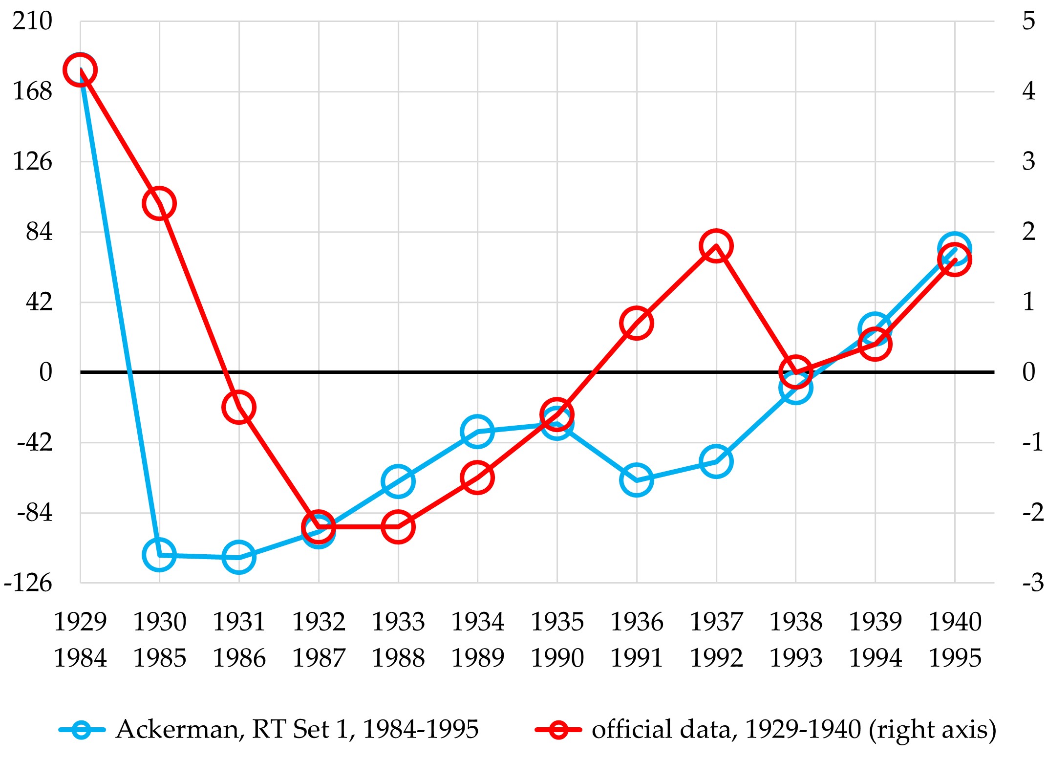
In addition, the RT’s Set 1 simulation implies that the collapse of capital accumulation in the post-1984 period was much more protracted than the collapse that occurred after 1929. As we noted, the simulation results indicate that net investment was negative for nine straight years, 1985-1993. During the Great Depression, in contrast, net investment was negative “only” between 1931 and 1935, a five-year period.
Because the pace of accumulation drives the growth of the stock of fixed assets, the RT’s Set 1 simulation further implies that, as capital dis-accumulated, the stock of fixed assets shrank by more than 10% (in real terms, i.e., after adjusting for inflation) during the nine-year period that began in 1985 (see Figure 5). This supposed contraction in the stock of fixed assets occurred during a period in which official data indicate that they increased by 26% and that real Gross Domestic Product (GDP) increased by more than 30%. Furthermore, Figure 5 shows that the contraction in the fixed-asset stock that results from the RT’s Set 1 simulation was both longer and deeper than the contraction that occurred during the Great Depression.
Figure 5. Real Growth of Fixed Assets & Gross Domestic Product, US, 1930-39 & 1984-1993
cumulative growth rates of real (inflation-adjusted) variables; fixed-asset data are for private nonresidential assets
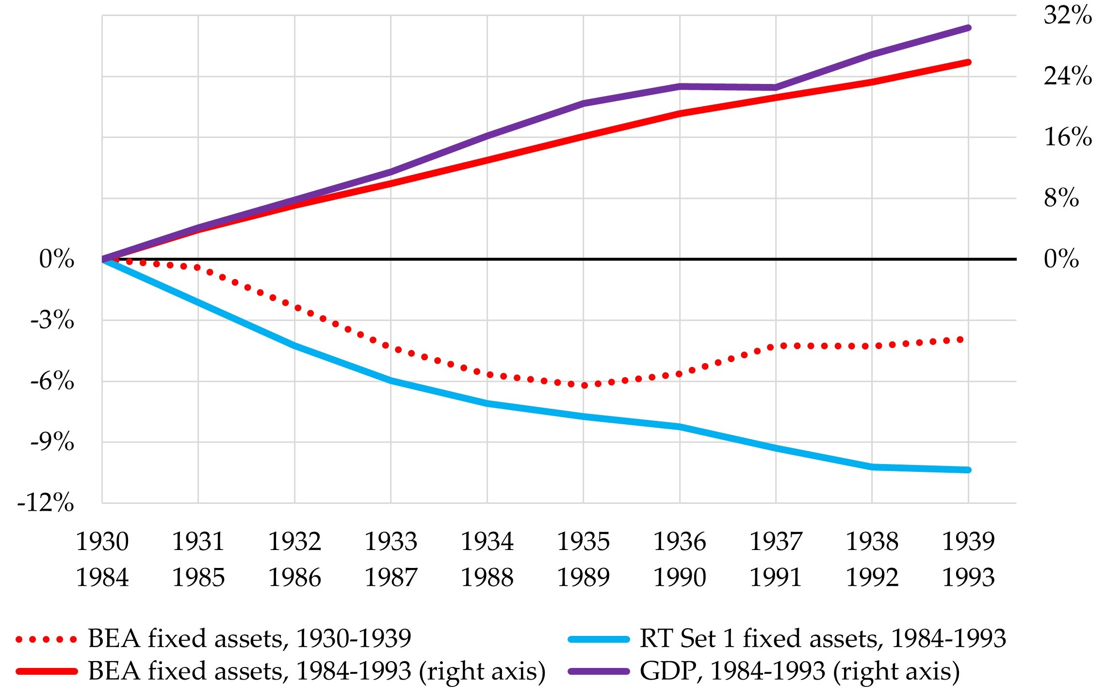
How could real GDP have increased by more than 30% during a period in which the stock of fixed assets shrank by more than 10%?[4] Only by means of a massive and wholly unrealistic increase in productivity. If we assume, fairly reasonably, that the growth of the total economy’s stock of fixed assets mirrored that of the private sector, these growth figures imply that productivity, in terms of fixed assets (i.e., real GDP per unit of real fixed assets), rose by 45.5% between 1984 and 1993. The RT’s Set 2 figures imply that fixed-asset productivity increased by 28.9%, which is also a whopping amount. In contrast, official BEA figures indicate that fixed-asset productivity increased by a total of only 3.6% during this nine-year period, and that it never increased by as much as 10% during any nine-year period in the post-World War II era.[5]
Fluctuations in economic activity are closely associated with increases and decreases in capital accumulation. For instance, as Figure 6 shows, the decline in real GDP during the initial years of the Great Depression, 1930-1933, was strongly correlated with the decline in net investment that took place at the same time. Similarly, the rebound in real GDP between 1933 and 1937 was strongly correlated with the rebound in capital accumulation that took place during the same period.
Figure 6. Private-Sector Net Investment & Real Gross Domestic Product, US, 1929-39 & 1984-94
percentage changes from initial-year values
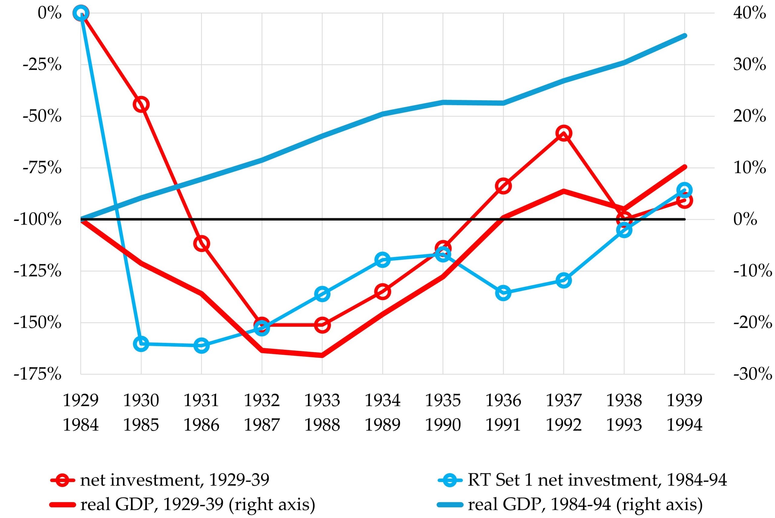
In marked contrast, as Figure 6 also shows, the economy grew relatively rapidly during the period in which the RT’s Set 1 figures imply that net investment plummeted (and during which its Set 2 figures imply that net investment stagnated). Between 1984 and 1994, real GDP increased at an average annual rate of 3.0%, which is very close to its long-run average growth rate, and it increased in every year except 1991. This disconnect between movements in net investment and movements in overall economic activity does not make economic sense. It is yet another unrealistic implication of the RT numbers that Ackerman relied upon.
Taken together, the implications of the RT that we have discussed make clear that there is no warrant to assume a massive and abrupt rise in the rate of depreciation beginning in 1985. That assumption is inconsistent with much of what we know about the performance of the US economy, and about relationships between different economic variables in general.
Ackerman’s Statistical Mirage
The authors of the experimental study (GKM&P 2021, GKM&P 2022) looked at how use of Canadian depreciation rates would affect several key economic variables. The rate of profit was not one of those variables. The US government publishes no official estimates of the rate of profit. All estimates of the rate of profit are those of other authors, and they are greatly affected by what those authors do with the government’s data, not just by the data themselves.
Thus, it was Ackerman, not the study’s authors, who chose to apply the experimental RT data to the estimation of the rate of profit. The rates of profit he computed on this basis shoot sky-high, starting in 1985. Yet this “finding” cannot be attributed to the experimental study or to its authors. It is the result of Ackerman’s decision to measure profitability using experimental figures that assume, unrealistically, that depreciation rates suddenly skyrocketed in 1985.
Ackerman attributes his “finding” to the fact that “Canadian asset-life figures were applied to US data” to produce the depreciation rates he used. He claims that “[t]he difference these make to the profit rate can only be described as massive.” This is not correct. As we have noted, and as we will show presently, use of Canadian depreciation rates was not the reason he generated skyrocketing rates of profit. Ackerman’s rates of profit would not have skyrocketed if he had used the experimental HT figures instead of the RT ones, even though both types of trials employ Canadian depreciation data in the exact same manner. His rates of profit skyrocket from 1985 onward because he used RT figures that unrealistically assume that depreciation skyrocketed from 1985 onward (see Figure 7).
Figure 7. “Rates of Profit” on Private Fixed Nonresidential Assets
net operating surplus as percentage of the fixed assets (both valued at current cost)
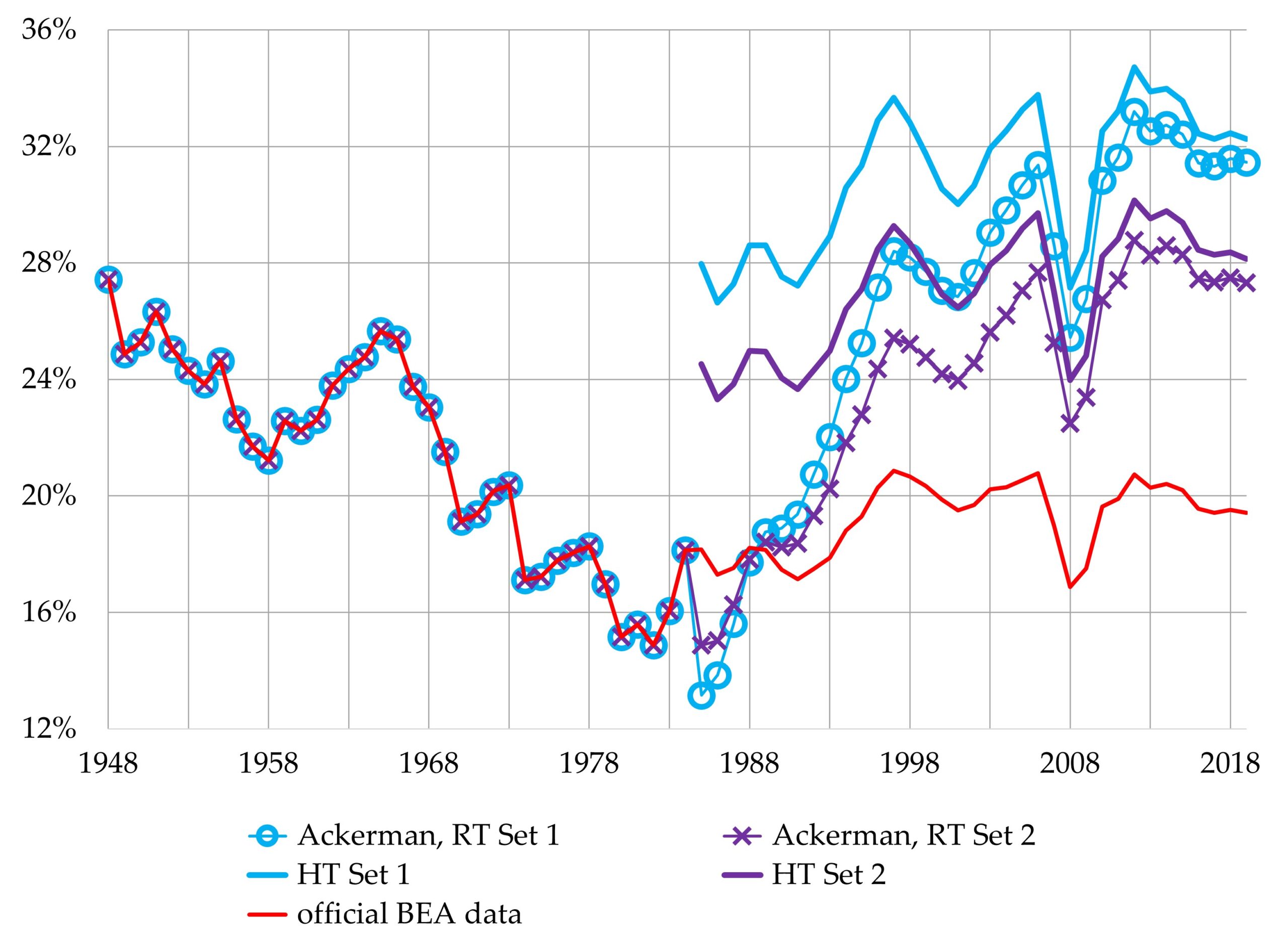
Five “rates of profit” are depicted in Figure 7. We put the term “rates of profit” inside scare quotes for two reasons. First, all five rates measure the profit of private businesses as a percentage of the capital stock of private businesses + households + nonprofit institutions + tax-exempt cooperatives. As we discussed above, the meaning of such measures is far from clear—if they have any meaning at all.
Second, none of the series is a genuine measure of the rate of profit, as Ralph Keller stressed in his previous critique of Ackerman’s piece. Genuine rates of profit are rates of return on investment. They measure profit as a percentage of the accumulated investment, that is, as a percentage of the actual amounts of money invested in the past to acquire capital assets, minus all depreciation. The rates depicted in Figure 7 are not rates of return on investment. They ignore the actual amounts of money that were invested, and instead measure profit as a percentage of what it would cost, at the end of the current year, to replace all existing capital assets with new ones.
The series that we have labeled “official BEA data” is not the BEA’s official rate of profit. The BEA does not have one, so Figure 7 simply depicts the ratio of its published figures for profit (net operating surplus) and the net stock of fixed capital, both valued at current cost.
The “Ackerman, RT Set 1” and “Ackerman, RT Set 2” series use the GKM&P study’s experimental RT figures for depreciation and the capital stock. Ackerman himself did not provide a complete explanation of his computational procedures, but our figures replicate his precisely (apart from very minor differences stemming from a recent revision of official data). The details of our computations are described in the appendix to this article. We used the exact same procedures to compute our “HT Set 1” and “HT Set 2” series, except that they use the data in the GKM&P study’s HT tables instead of the RT data.
The HT and RT tables use the exact same Canadian depreciation data and in exactly the same way (with one exception). Yet the RT “rates of profit” rise sky-high, while the HT “rates of profit” do not.
The fluctuations in the HT rates mirror the fluctuations in the “official BEA data” rate fairly closely. The HT rates end up at a much higher level, but they also begin at a much higher level. The gaps between the HT and “official BEA data” rates increase only modestly.[6]
Since the HT and RT figures differ for one reason only—the RT introduces Canadian depreciation rates abruptly, in the middle of the sample period, while the HT applies them throughout the entire sample period—it is this difference, and it alone, that explains the markedly different trajectories of the HT and RT “rates of profit.” And, more importantly, it is this difference, and it alone, that explains why the RT “rates of profit” rise sky-high while the “official BEA data” rate does not.
In the previous section of this article, we explained why the RT’s assumption that the rate of depreciation rose, abruptly and massively, from 1985 onward is unwarranted and unrealistic. We now wish to explain why this abrupt, massive rise, not the use of Canadian depreciation data, is responsible for Ackerman’s soaring-rate-of-profit mirage.
What is at issue here is the difference between a variable’s level and its trend. Changes in the level of the rate of depreciation lead to changes in the level of the rate of profit, but they do not affect its trend. What affects the trend in the rate of profit is the trend in the rate of depreciation.
Thus, the use of Canada’s higher rates of depreciation leads to a higher rate of profit, but not to a rising rate of profit (all else being equal). What leads to a rising rate of profit is a rising rate of depreciation.
Both the HT and the RT experimental series are based on rates of depreciation that are higher than the official BEA rates. This leads to rates of profit that are higher than those computed on the basis of official depreciation data. But the HT rates of depreciation are higher than the official rates throughout the entire sample period. All else being equal, they do not rise in relation to the official rates, and they therefore do not lead to rising rates of profit. They certainly do not abruptly skyrocket and thereby lead to skyrocketing rates of profit.
In contrast, the RT rates of depreciation are identical to the official US depreciation rates through 1984, but much higher than them from 1985 onward. This leads to rates of profit that, through 1984, are identical to the (low) rates of profit that we get when official depreciation rates are used. Then, the rates of depreciation rise, abruptly and massively, starting in 1985. This spurious rise is what causes the massive rise in the RT “rates of profit.” The use of higher Canadian depreciation rates as such does not.

Conclusion
This article has exposed the fact that Ackerman’s soaring rates of profit in the “US business [sic] sector” are merely a statistical mirage. What makes them rise sharply is his egregious mishandling of data and an equally egregious distortion of a recent experimental study that explored the potential effects of applying Canadian depreciation rates to US data. His unwarranted declaration that the Canadian depreciation data are “obviously … superior” to official data, as well as the rest of his “cowboy scientist” behavior and the skyrocketing rates of profit it produces, all serve to confirm his preconceived notion that Marx’s falling-rate-of-profit theory cannot possibly be right.
Clearly, Ackerman and Jacobin should retract his analysis. But we are under no illusion that they will do so willingly, or that their followers will make them do so. They are engaged in a political-ideological battle, not pure scientific research. Ackerman goes out of his way to disrespect and discredit Marx’s theory and its proponents, repeating a lot of invective that has been hurled against them (“sectarian millenarianism,” “fetishization of the falling tendency of the rate of profit,” “sterile orthodoxy,” “fundamentalist”), and adding to it with additional invective of his own (“ultramontane,” “strident dogmatism,” “its noisiest champions”).
With this rhetoric, he is appealing to the True Disbelievers—diehard opponents of Marx’s theory—and trying to create additional ones. We suspect that this strategy will succeed, that his audience will find his rhetoric to be more persuasive and decisive than our arguments and empirical evidence, and that they will therefore want to dismiss our exposé of Ackerman’s methods and conclusions.
We lack the power to stop them. We can only point out that, when they accept Ackerman’s revised rates of profit—especially the rate based on the “recent trial’s” Set 1 data that he specifically endorses—they are implicitly accepting that dataset and all of its other implications as well. In particular, they are accepting that:
- the rate of depreciation rose only slowly, then suddenly soared in 1985, and then, just as suddenly, resumed its slow growth
- the rising rate of depreciation caused capital to dis-accumulate (i.e., net investment to become negative) for nine straight years
- this period of dis-accumulation was just as severe as, and much longer than, that of the Great Depression
- the accompanying contraction of the real capital stock was more severe and longer than that of the Great Depression
- the productivity of fixed assets increased massively during the nine years of dis-accumulation
- the decline and subsequent rebound in capital accumulation had little or no effect on real GDP growth
We look forward to their attempts to defend these propositions. They will not succeed. That is why they must and will continue to hurl invective instead.
Appendix: Data Sources and Notes on Computations
Official BEA Data (available here)
Depreciation (consumption of fixed capital) at current cost, private nonresidential: Fixed Assets Table 4.4, line 1
Fixed assets at current cost, net stock of private nonresidential: Fixed Assets Table 4.1, line 1
Fixed assets, real (chain-type quantity), net stock of private nonresidential: Fixed Assets Table 4.2, line 1
Gross domestic product (GDP), real: National Income and Product Accounts Table 1.1.3, line 1
Investment, in private nonresidential fixed assets: Fixed Assets Table 4.7, line 1
Net operating surplus, of private enterprises: National Income and Product Accounts Table 1.16, line 2
GKM&P 2021 Working Paper (available here)
All experimental estimates are reported in four tables: RT Set 1, p. 113; HT Set 1, p. 114; RT Set 2, p. 115; HT Set 2, p. 116. Each table provides estimates of depreciation (consumption of fixed capital), the net stock of fixed assets, and net investment, for all private nonresidential fixed assets, at current cost.
Notes on Computations
Figure 2: each rate of depreciation is the dollar amount of depreciation divided by the net stock of fixed assets at the start of the year (i.e., the prior year’s end-of-year figure).
Figures 3, 4, and 6: Net investment is investment minus depreciation.
Figure 5: Our real (inflation-adjusted) RT Set 1 figures for the net stock of fixed assets are the official BEA real fixed-asset figures times the ratio of RT Set 1’s net stock to the official net stock.
Figure 7: Each “rate of profit” is private enterprises’ net operating surplus (NOS) as a percentage of the net stock of nonresidential fixed assets of the entire private sector, both valued at current cost. The BEA-based rate uses its NOS and net stock figures directly. For the 1985-2019 period, Ackerman’s RT Set 1 and RT Set 2 NOS figures are the official figures minus the difference between the relevant set’s depreciation estimates and the official depreciation figures; his RT net stock figures are those published in GKM&P 2021. To compute the HT Set 1 and HT Set 2 rates, we employed the same procedures but used the data in the HT tables rather than the RT ones. The pre-1985 RT figures are the same as the official figures. The GKM&P study provides no HT figures for years prior to 1985.
Notes
[1] The quoted material comes from the text that accompanies Ackerman’s graph.
[2] The working paper, BLS Working Paper 539, is titled “Alternative Capital Asset Depreciation Rates for U.S. Capital and Multifactor Productivity Measures.” The title of the Monthly Labor Review article, published in its November 2022 issue, is almost identical: “Alternative Capital Asset Depreciation Rates for U.S. Capital and Total Factor Productivity Measures.”
[3] Specifically, an asset’s Set 2 depreciation rate is the Canadian figure for its “declining balance rate” divided by the US figure for its “service life.” The declining balance rate measures the degree to which the asset loses value more rapidly when it is new than when it is old. The asset’s service life is the number of years during which it remains in use.
[4] All fixed-asset figures in this paragraph refer to private nonresidential fixed assets. That is, they exclude houses, apartment buildings, and the like.
[5] Labor productivity (real GDP per unit of labor) increases much more rapidly than fixed-asset productivity does, because technical changes almost always conserve on the employment of labor rather than on the employment of fixed assets. In general, fixed-asset productivity increases very slowly, if at all.
[6] The sizes of the gaps in 2019 were almost identical to those of 1997. Between 1985 and 1997, the gap between the HT Set 1 rate and the “official BEA data” rate increased by 3 percentage points, and the gap between the HT Set 2 rate and the “official BEA data” rate increased by 2 percentage points, partly because “Canadian” depreciation rates rose more rapidly than US depreciation rates.
Editor’s Note, Aug. 13, 2024: typographical error in title of Figure 4 corrected.

This article convincingly refutes Ackerman’s arguments and results. One of Kliman/Keller’s arguments: Unrealistically high rates of depreciation produce a dramatic rebound in the rate of profit.
However, applying a different method of calculation, Jefferies presents a very similar U-shaped rate of profit.
(Jefferies, W. (2022). The US rate of profit 1964–2017 and the turnover of fixed and circulating capital. Capital & Class, 0(0)).
Thus, in defense of Ackerman, some falling-rate-sceptics might point to this similarity as supporting the plausibility of Ackerman’s results.
By committing different errors, Jefferies and Ackerman arrive at the same U-shaped development in the rate of profit. Jefferies includes turnover-cycles, the rate of turnover, in his set of explaining variables. This speeds up the depreciation, thus boosts the rate of profit. Measured against Jefferies, Ackerman’s results may appear to be plausible.
Thanks, Michael.
Jefferies is not a real researcher. Every move he makes is in service of his preconceived notion / pet theory that the collapse of the USSR rescued western capitalism–led to a massive rebound, etc.
I can document this charge. He was originally on record as a supporter of the temporal single-system interpretation of Marx’s value theory. But he then turned on a dime, the moment he understood that the temporal conception of the rate of profit leads to the conclusion that there was no rebound in profitability in the US despite the collapse of the USSR.
So I’m not even going to look at his latest stuff. … This is not ad hominem dismissal. Instead, I’m saying that his “evidence” doesn’t qualify as evidence because every move is cherry picked to support his preconceived notion / pet theory. His results aren’t findings. They’re concoctions.
Thanks, Andrew
I myself will spend some more time on J’s objections against the
Hulten and Wyckoff measurement of depreciation and on his decision
to prefer “the Internal Revenue Service Depreciable Assets less Depreciation as a more accurate estimate of the actual quantity of fixed capital advanced”.
Hi Michael,
yes, Andrew is correct when he says that Jeffries is not a real researcher. Being somewhat familiar with his stuff, I must say that Jeffries fits the description of a cowboy scientist.